Showing posts with label tutorial. Show all posts

Wednesday, 5 January 2022

πŸŽ€πŸŽˆπŸ’–THE BEGINNINGπŸ’–πŸŽˆπŸŽ€


Hello lovelies!
With the chance of my new upcoming solo show with Curio Art Gallery in Portugal, which is themed around Alice in Wonderland, I'll be showing you a bit of my process of how I prepare the work I'll show, so that you can learn sth on the way, whether it is a few technique tricks or the madness of an artist πŸ€ͺπŸ˜‚πŸ’–

So, let's start with the bunny today...! I decided to start working on the messenger bunny as a first piece, and not the white rabbit, because of the colors! This was the ideal theme to warm me up! A solo show carries a lot of weight and responsibility, it really is hard to explain. I personally see it as a challenge to outdo myself, to go further than I have reached until then, always artistically speaking. On a solo show you work together with a gallery and it is an honor for an artist to be picked by a gallery, so like a parent that has invested in you and helped you, you want to make them proud of that choice and the faith they showed in you!! πŸŽ€


The messenger bunny dressed on the gown of hearts, with warm pinks and reds all around, seemed like the perfect mood-fixer to begin with! Warm colors make you feel more vibrant and more optimistic in my opinion, and are more suitable for activity and 'let's do it' mood!


I started out with a first sketch (above). Eyes are not a problem for me, since I started sketching them at the age of 14, so...many years of practice 😜!!

But the bunny in my first sketch looked older, and more serious than I wanted. Big eyes make a figure look young, but the distance between eyes and the chin line is very important to achieve youth: the closer the eyes are to the chin, the younger the figure. It's the same with children if you observe! With a little tweaking on Photoshop, the sketch came to where I wanted, so that was done:


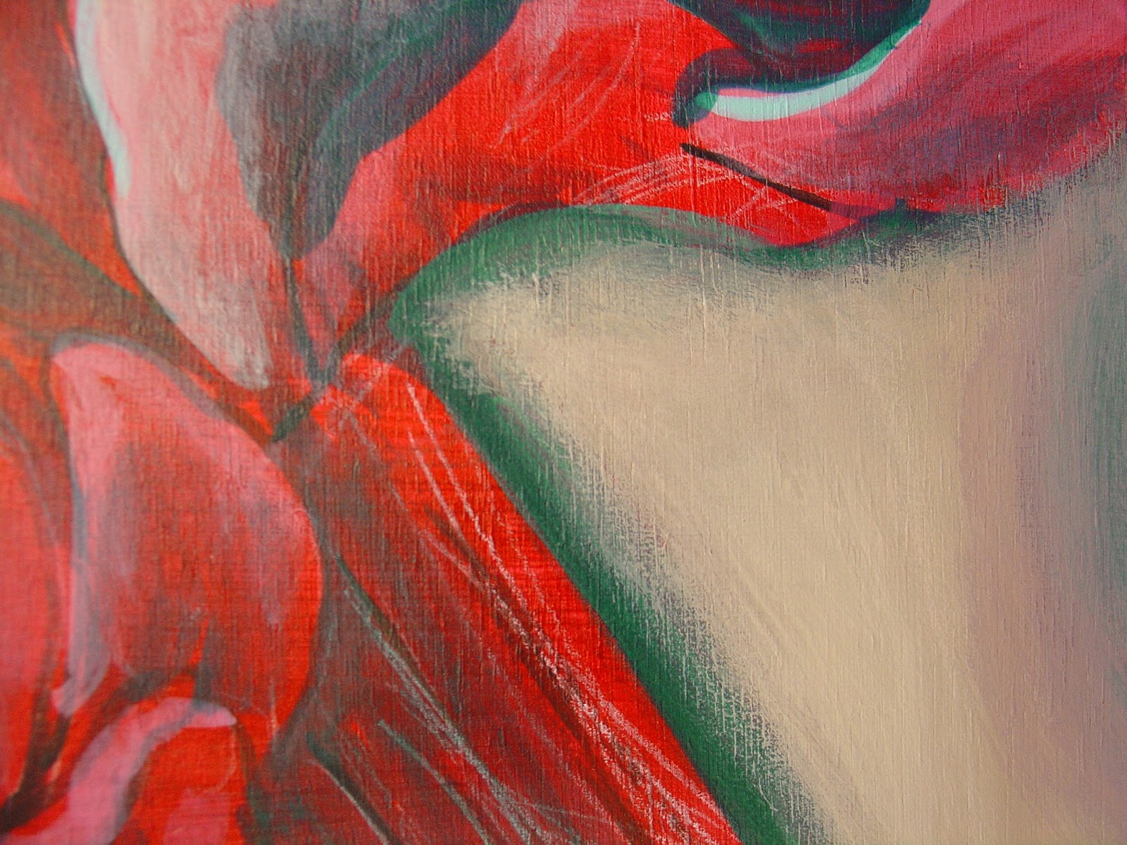
Many times I make a B&W shading sketch, but for this one I needed the color therapy asap, so I painted my initial sketch with gouache. The result is what you see in the first picture. I was quite happy with it (lucky me!) so this one is ready to go on the painting process now πŸ’–πŸ€—!!

We'll let this be for a while and on the next post we'll talk about fur, so if you're an animal lover, don't miss it ❤πŸ˜‰!

Monday, 5 October 2015

Tips+tricks series starting

For those of you who don't know, I am a self-taught artist. Self-taught meaning that I've hand-picked numerous art books which have shown me things that I would have learned in an art school I suppose, and I've spent endless hours of my life trying to learn every little detail that will make what I paint look a little better than yesterday, and me a little more happy tomorrow...

The main reason I still spend time on social media is to learn, Internet is a great tool and a great source of knowledge. So I'm thinking to contribute my piece to this process, and post occasionally some tips that I find handy, simple things really that however may be of worth to some beginners. I'll be marking such photos with a 'tips+tricks' stamp so that they're easy to recognize. 

Below is me working on 'Lolipop Rococo'. You see that I'm laying a dark blue color on the bows, although you may see them turning out purplish, even whitish in the end. The reason is that blue lies everywhere(thankfully!), on every shade, on everything we see. The sky is blue, the sea is blue, and they're all around us. Every shadow has blue in it and every dark part of your painting should too. Don't use stand-alone colors as I see in so much artwork posted around. Mix up things on your palette a little and play around. You'll be surprised... wink emoticon 


Friday, 28 August 2015

WIP : "French Croissants" by Zelyss

My last two paintings, "Thursday" and this one, are small and rather 'rushed' because I'm trying out surfaces again. Canvas ("Thursday"-previous post) seems to accept paint better, it's easier to work on, but the 'bumps' are visible and I don't like it. I prefer the smoother texture of the board.

The following WIP ("French Croissants") is on primed masonite, and again masonite proves too smooth for me. It helps to get easier the facial colors but the paint needs 2-3 layers to stick on and have the thickness I like, and I don't know if I have enough patience for that. Pff! Potato-potato!


Tuesday, 21 July 2015

Cheap and Chic : no cost Stay wet acrylics palette


Don't know if you're into crafting, but if you are, you're surely already into using items for multiple purposes. Have you ever tried using an one-use plastic party plate as your palette? Do so. It's the cheapest, lightest palette you can have on your hand. 

The plates come into a variety of sizes and colors, which means you can choose whichever is more convenient for you.


Now as for the staying-wet part. It's not as tricky as you might think. Your best friend here would be a spray bottle filled with clear water. You should use it every now and then (depending on the humidity of your conditions and temperature, the time varies). You will learn from experience how often you need to do it while you're working to keep your paints moist (in general one round-around spraying every 10 minutes should be enough). And after you're done with your painting session, you spray with water once more (if you haven't done so quite recently) and you put the paper plate under another sold plastic plate, tray, whatever you have available, with some weight over it for extra sealing (I use the water jar that I use for cleaning my brushes). Done!


If you will not be using the colors for over a day, just uncover, spray once, then cover again. You're set for another day. I use the same plate palette for the entire painting. It saves money and tears, believe me!

Hope you find this useful, ever since I tried it, it's the only way for me.


Till next time, 

:)
Zelyss


Wednesday, 1 July 2015

Tutorial #3 : Glimpses of my process - FIRST STAGES: Sketching and shading

So I woke up this morning in a foul mood, crazy things are happening these days. Since I'm not at a point of pure happiness, I decided I might give someone else a chance to feel lucky today :)

Jokes (or not) aside, I am sharing below a little bit of my process with you. This is the current painting I'm working on at the moment, it will be titled "Rosemary, the time keeper".

So, let's begin!


1) On gesso primed and sanded board (I have given details of the boards I am using on previous tutorial, see here: BOARDS TUTORIAL), I paint on a greyish background and once it's dry, I transfer the sketch. The initial transfer is by pencil, then I trace it again with a very thin brush dipped on diluted acrylic paint.


2) The next step is establishing values and tones. First come the highlights (with pure, diluted, white) and then the shadows. The process is a little bit like this: 

paint on...


3)
...then smear. 
So that we get that shady effect. The paint must be really thin and you mustn't fear getting your fingers a little dirty. But I don't believe there is any artist who does.


The process of establishing the values is very important, simply because it gives an idea of what the painting will look like, and at this point it is easy to see and correct the mistakes. I used to do this by pencil on the initial sketch as a guide, but I now prefer to do it directly on the painting. It is one of the most fun steps of the way, perhaps the one I enjoy the most! At this stage it is good to take a photo of your masterpiece, to keep it as reference afterwards, because layers of paint will start covering everything pretty soon and you will not remember where is what in the end.

That's all I got for now, but I will keep you updated soon. Have you liked my tutorial so far? Then how about dropping by my facebook page here : FACEBOOK ZELYSS and like my page. 
I like to gain fans the fun way! 

See you on my next post!


Tuesday, 23 June 2015

Alice in process

So I'm working on two pieces at the same time at the moment, my first one Eve should be finished in a couple of days, the second one -Alice- is in first stages still. I'm posting some photos of the process here:

...first the sketch...

 ...then the transferring and lining...

...and follows the highlights+shading 
(rough guide for giving an idea of how the final painting will look like)

Keep checking for follow-ups!

Thursday, 4 June 2015

Tutorial #2: Panel qualities - which wood should you choose?

Hi there! Today I decided to post about types of wood panels/boards to work on. You see I just had a new stack of boards delivered to the studio, ready to prime and paint (yeah!). Here they are below, in several sizes.


So I have had my fair share of several attempts of painting on several surfaces. I have even painted on a red PVC surface (see my painting "Circus Madelein" below).


As I said to my previous tutorial, the key is always proper priming, with several Gesso primer layers and a high dose of patience (for waiting out the layers to dry).

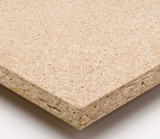
But of course, I do not suggest working on PVC. Stick to wood boards. Now of those, the best and most responsive to my technique is the chipboard, and it is the one below. You can probably find it under other names but this is what it looks like:


This material, with 3 layers of gesso and a little sanding with a fine sandpaper (I use no.400), can be perfect. It does not absorb the color, it has "tooth" for the paint to stay on, it is smooth enough for when you are dry-brushing, but no so smooth to make the paint flow uncontrollably.

Other types of wood boards, which I don't recommend, are the following.

MDF: too satiny, when primed it has a lot of grain raised that will destroy my brushes, and if sanded it again becomes too smooth. 


And last, and worst, plywood. I bought several pieces of plywood with the hope that since it is actual wood, the outcome would be better, but no. As seen in the photos included in my previous tutorial, when the paint goes on, despite priming, the result is risky. Not a chance to be durable.


Never be afraid to experiment, you may find some other surface that works best for you. And never let failed attempts discourage you. There is always a better piece of art waiting ahead, as long as you are there to make it.

Stay tuned for my next tutorial on ways of priming. And if you like my page, drop on my facebook page: https://www.facebook.com/pages/Zelyss/1026378090720993? or my google+ page: https://plus.google.com/116934195623571090402/posts and 'like' /add my page to get more of my news. 

Friday, 29 May 2015

Tutorial#1: Proper priming of your wood board (/panel)

or HOW TO KNOW when NOT to start a painting

I am not big on preparation. I hate the boring stuff. Gesso, undercolor, sketching. If I could, I would skip directly to coloring. BUT. If you are like me, impulsive and rushing, you're more than likely to find yourself with a lot of unfinished business.

So here goes, my exceptional tutorial:

1. You prime your wood panel with gesso. If you are sane, you must put there at least 2+ layers. If you're me, you might leave it at 1. Don't.

So, you prime:

You put the base color:

 You blow-dry (see? impatient altready!)

then you sketch:

and you start painting (values, undertones, etc.)

And just when you're right about here, 
you STOP!
Rubbish, no good, don't finish, throw away!
Why? 
(meaning asides from the obvious mid-process state. 
Well, don't judge by that, they all look kind of freakish until shortly before they're done). 

You stop,
because:

The paint just WON'T lay on the panel. Not like it's supposed to. 
So you can't get the result you must get.
And the panel has all these half-raised fibers that look threateningly wild-spirited, 
If you scratch them, they might come off. 

There goes. Bye-bye to my sweet hours spent so far on this piece. 

Err if you must, dear friends. Or if you wish, learn by me. 

Layers of Gesso: 2+
And don't rush.